The pros & cons of different styles.
There are 5 basic styles of ranging type (other than ranging 'around' a shape) and all have their good and bad points.
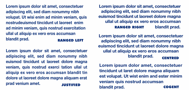
Ranged Left. This probably applies to most advertising typesetting. Its pros: easy
to create, easy to read.
Its cons: it can create ugly and ragged shapes on the right edge which, if possible,
need to be addressed by the designer.
Ranged Right. Often seen in press ads and brochures. Its pros: easy to create,
often helpful to a design.
Its cons: far less easy to read and again can create ugly shapes (on the left edge).
Should only be used with a limited amount of copy - and with care.
Centred. Its pros: easy to create, sometimes interesting in a design. Its cons: usually difficult to read and again can create ugly shapes. Should only be used with a limited amount of copy - and with great care.
Justified. Interestingly, used in almost all books & newspapers. Its pros: easy to
create, easiest copy to read.
Its cons: can create some extremely irregular letter and open word spacing and really
requires a fairly long line length
(i.e. over 70 characters).
Cogent. A method of adjusting spacing manually for range left / right & centred
settings by opening up, or closing specific character and word spacing. Its pros: creates very attractive (and readable)
shapes to the copy. Its cons: can be quite time consuming to create and is only really used with a limited amount of
copy.
I've no idea where the name originated - but can look great!