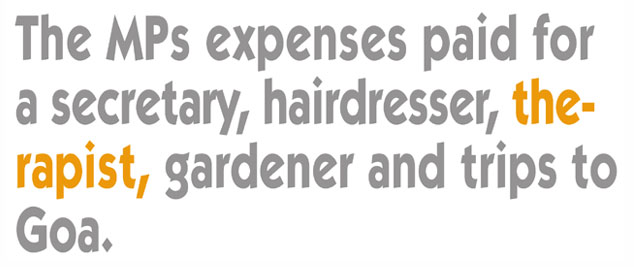
At best, unfortunate, at worst disastrous!
Over the last few years, the standard of typography has sadly slowly deteriorated and increasingly we see very basic typographical errors appearing - including the irritating (and often entirely unnecessary) word breaks.
Sometimes this is due to complete laziness on the part of the 'designer' who has simply input the copy from a word document and allowed it to flow into the designated area - and if it fits then that is supposedly fine!
However, more often than not it's because of having a limited understanding of typographical excellence and the inability to 'craft' the type to become not only as 'readable' as possible, but also as aesthetically pleasing as possible and unnecessary word breaks will not help either of these factors. And, as we can see above, it can even lead to seriously unfortunate results.
Another basic error seen so often these days (particularly on websites) is the dreaded 'widow' - a word that has been allowed to fall all on its own.
It was once, and in my opinion still is, one of the biggest crimes in typography, unless it's a very long word, i.e. 12 plus characters and even then it's dependent on the line length and it should never happen! (although with web based copy it isn't always that easy to control as html type may open differently in different browsers and I've no doubt the odd irritating widow will crop up on this very website).