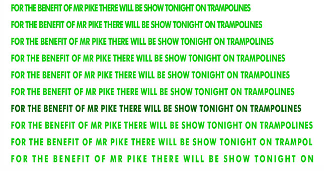
Or 'tracking' (not to be confused with 'kerning')
Another aspect of typography that can completely change both the character and legibility of text.
Text that is set far too tight (set very close , or even with 'minus' character spacing can often be very difficult to read and is also usually irritatingly ugly. There are exceptions to this, particularly with larger sans headlines.
Text that is set with very open character spacing can also be sometimes difficult to read (and again have an awkwardness that can be annoying) and is normally only used in smaller pieces of type (i.e. 4 or 5 words) but with the word spacing opened up accordingly.
The actual amount of character spacing that is used is dependent on a number of factors that affect each other - the typeface, the line length, the type size and the line feed - and the character spacing is very much determined by all of these working together.
Note that tracking is an overall spacing adjustment over a whole group of words, letters or even the entire piece of text, whereas kerning is a very specific adjustment between just 2 characters.