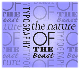
The Art of Typography. Sadly, a phrase you rarely hear these days.
Typography was once one of the foundation skills of every advertising designer, art director and commercial artist, and virtually every major Ad Agency in the world had a Typographer or Type department (housing perhaps 4 or 5 'Typos').
Sadly, we have seen the quality and excellence of Typography slowly erode over the years and I'm quite sure that this is due to two basic reasons.
Firstly, the advancement of technology (the PC, the Apple Mac and software such as Photoshop and Quark) all phenomenal developments that have opened up extraordinary opportunities for the designer. However, it's now become far too easy to switch on a Mac and then very quickly learn how to 'put an ad together' without any basic understanding of typography, format, balance, aesthetics or light & shade, and this lack of skill or experience often shows through.
Secondly, (and largely because of the Firstly) this has led to a very considerable lowering of acceptable standards and a bit of an 'it'll do' mentality that we witness so often, as well as a flaky understanding of the word 'excellence'.
What was once 'poor' and unacceptable is now 'OK'.
This all really hit home to me recently when I mentioned the 'T' word to a Mac operator (of about 4 years experience) whilst he was working on an ad - and to my utter disbelief he had never even heard of the word typography . What chance had the ad got?
Typography in advertising has a very serious, and often complex job to do - yet it must be simple!
It has to convey the message, strategy and character of the advertisement (or brochure), the nature of the copywriter's words, the 'feel and flavour' or attitude of the brand, the urgency of an offer, and also allow for the different specifications of the media.
More importantly, it has to be read, easily, or the reader switches off!
Typography in Graphic Design is very different.
It can be amusing, it can be fun. It can be incredibly difficult to read (which may be part of the fun) and it can easily be the central focus of the design as opposed to an advertisement where the main factor is more than likely the 'benefit', the 'message', or specifically, the headline (which, of course, may contain the message).
So, at the risk of sounding like a Luddite, this is one of my real soapboxes and I'll always call for more excellence and care with typography in advertising.
Typography can make a poor ad good, and a great ad poor.